If you’re trying to grow your fitness business, you need to know all about gym landing pages.
These are the carefully designed web pages prospective clients land on when they click an ad.
They’re designed to accomplish a marketing task, and every element has a job to do. Words matter. So do pictures. And layout is a big deal. Also important: Your offer. People need to understand and want what you’re offering.
A good fitness landing page catches the viewer’s attention and generates desire with a clear, compelling offer. Prospective clients can’t help themselves. They must click that button or trade their email address for an amazing, irresistible resource, promotion or service.
A bad gym page confuses people and sends them looking for the back button. These pages are unclear and incongruent. They don’t motivate people to act or they attract the wrong people to look at products and services they don’t want.
Think of a good landing page as funnel that sends people into your business, triggering marketing automation and lead nurturing sequences along the way. It’s a money maker. Think of a bad gym page as toilet where money circles the bowl before it vanishes forever.
Learn and Earn: Analysis of Fitness Landing Pages
So how do you avoid wasting precious advertising dollars sending people to landing pages that don’t convert? You look at other landing pages in the fitness industry and learn. Then you design your own pages to ensure they do exactly what you want them to do.
Or you get a professional to build amazing pages that help you connect with clients and make sales while you focus on other aspects of your business.
The market is full of landing page/website builders, such as ClickFunnels, Squarespace and Leadpages. They all offer different service packages. Some must be integrated with other software—databases, messaging platforms, etc. Others—like Gym Lead Machine—handle all aspects of marketing on one powerful platform.
Resource: The Essential Elements of Great Gym Websites
Whatever path you choose, you should understand how landing pages work and why they’re essential elements of marketing.
Below, we’ll tear down eight gym landing pages—the good, bad and ugly. We’ll tell you what we like and what could be better. Then we’ll give you some best practices you can use on your pages.
Gym Landing Pages: Our Detailed Inspection
1. New You Challenge
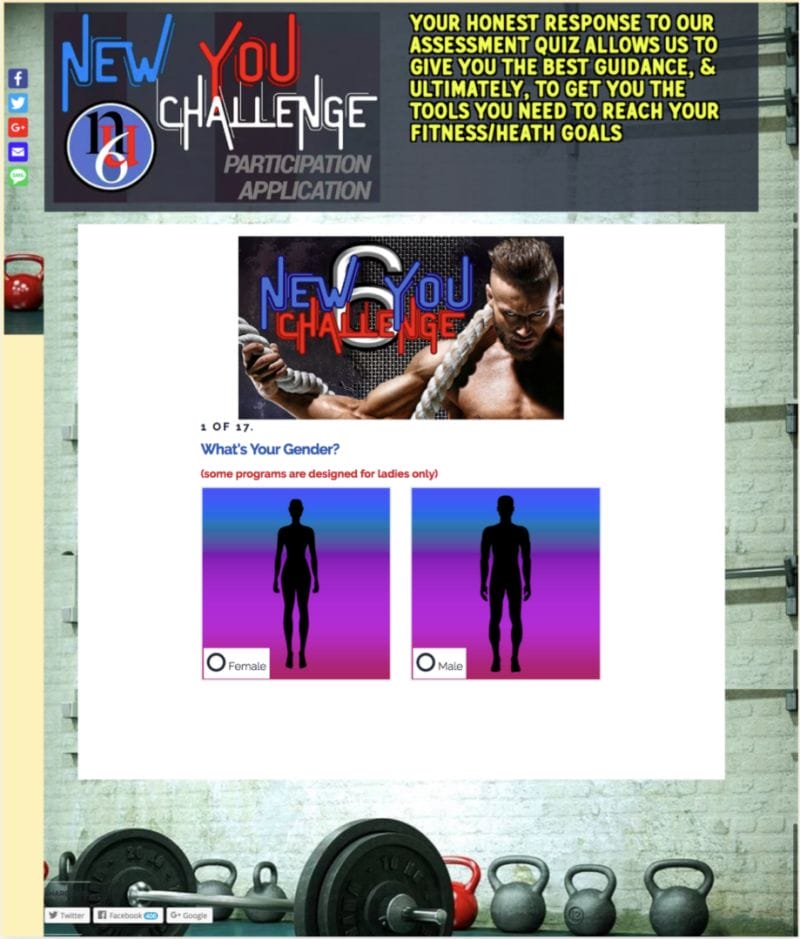
This is one ugly sucker—and that’s a good thing.
In marketing, a few rough edges often create a genuine, authentic vibe, and perfect polish can actually deter viewers who feel as if things are “too slick.” Beyond that, ugly often equals simple and clear—which is great. Intricate design and lots of bells and whistles might be needed to convert a client who’s interested in a graphic design service. But in many industries—including fitness—simple, rugged pages can work.
Resource: “Why Do Ugly Landing Pages Work So Well?”
The text at the very top is short and clear. It points you to one thing: Fill out the quiz and receive health and fitness advice, and the photos all point to fitness. The ad that pushed people to this page used a “total body transformation” as a hook, and the landing page copy matches up with that. To find out more, all the viewer has to do is answer quiz questions—which is fun and commitment-free.
The quiz serves several purposes: It warms the lead and it gets him or her to supply key information the sales team can use as talking points after opt in. But it also starts a conversation, and each question is a “micro-commitment”—a string of yes’s that will likely end with a larger yes. The more questions the person answers, the more likely he or she is to book the free consultation at the end of the quiz. This prequalification also weeds out a lot of people, so sales reps speak to leads who are much warmer.
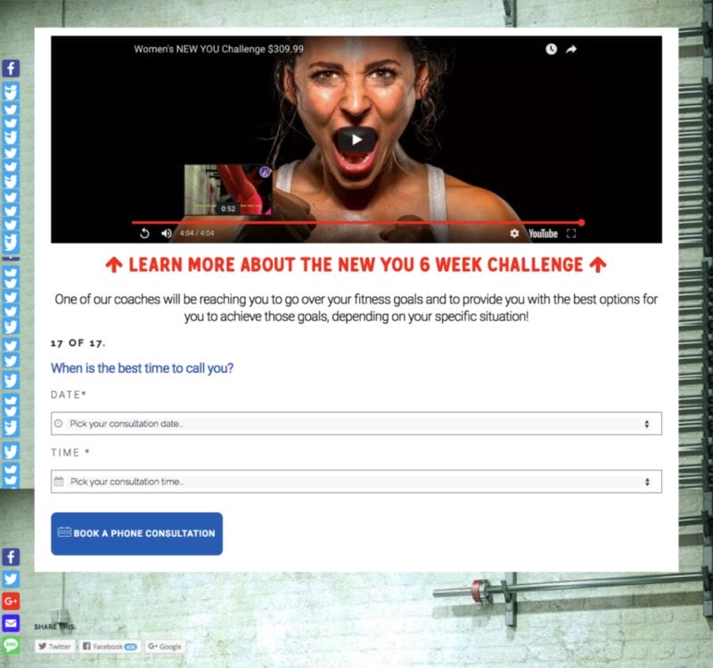
Also interesting: This two-part landing page uses an explainer video at the end. Most put that at the beginning, but here the quiz is doing the heavy lifting and the video is there to sweeten the pot when the prospect is asked to book a consultation.
Key Features: Rugged, basic design. Quiz technique.
2. Equinox
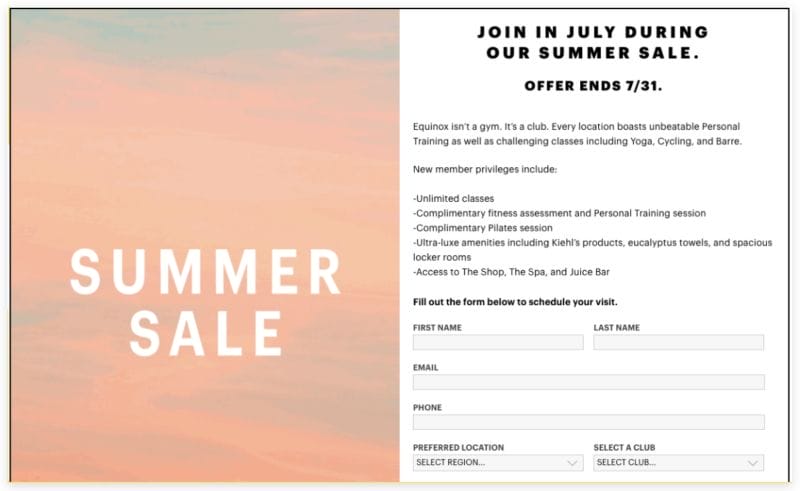
Equinox’s minimalist landing page mirrors its minimalist ads. And the ads reflect the brand’s simple value proposition: Access to a luxurious, high-end facility.
While smaller chains and independent gyms tend to favor long-form copy designed to provoke a direct response, the larger brands tend to ignore traditional marketing wisdom and go their own way. For them, it’s not always about a direct response. Sometimes, it’s about branding. In this case, it’s about a sale—with no dollar value or percentage given.
Clickers access this landing page through sparse ads promoting a summer sale in a “stunning club.” That’s it. Mic drop.
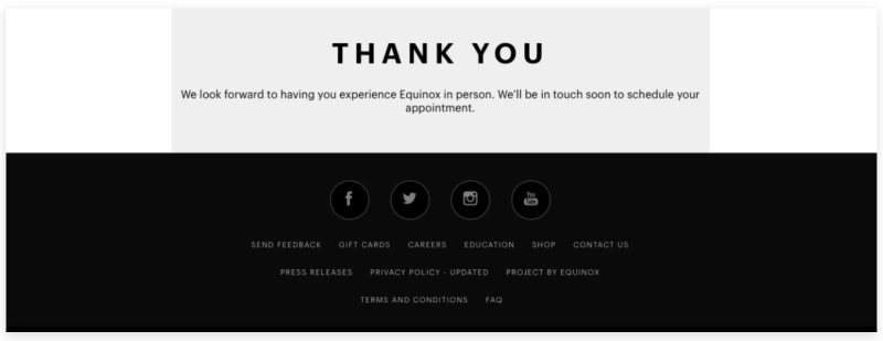
When viewers hit the landing page, they don’t get much info beyond “sale ending soon.” Throw in a little copy related to amenities, and then it’s time to ask a viewer to book an appointment. After that, Equinox shows a bare-bones thank-you page.
Served to a person who doesn’t know the brand at all, this ad will toss a clicker onto a landing page that does little to close the deal. No pictures of gyms, no explainers, no abs and aspirational characters. Just a touch of urgency and the scent of eucalyptus.
Key Features: Simple, clean design. Blunt but vague. On brand.
3. Orangetheory Fitness
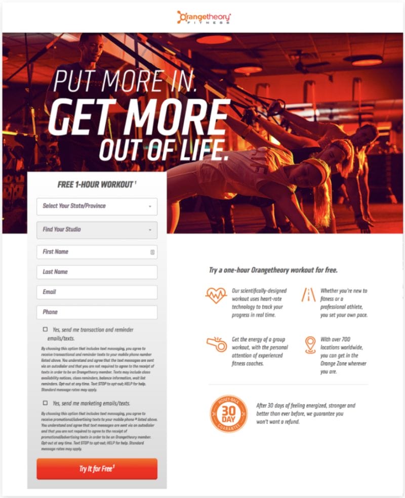
Orangetheory is going more traditional here: “Free!”
That’s 100 percent related to the company’s promise to provide the “best 1-hour workout in the country.” If that’s true, then all the marketers need to do is get a person into a class—so that’s what the ads are designed to do.
This approach works well for facilities where anyone can just drop into class. It works less well, if at all, for CrossFit-style facilities that sell coaching. Their best intro process is a consultation, not an ass-kicking workout—though many affiliate owners still haven’t realized that.
The best part of the landing page is that it’s clear and presents a low-barrier offer with benefit bullets. And there’s a guarantee that limits the prospective client’s apprehension. In sum, this page clearly says, “This is a cool gym where you will get fit or get a refund—and you can try it for free.”
Aside from the form fields and legal-ese, Orangetheory presents its offer in fewer than 100 words.
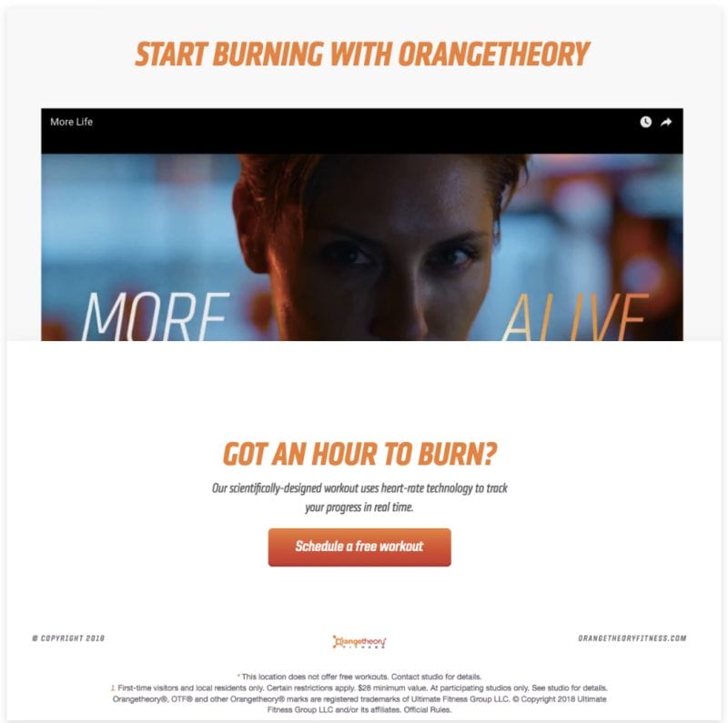
After the lead capture through the form, viewers are sent to Page 2 while the marketing triggers go off in the background. On that page, they get a “sizzle video” designed to fire them up to book an appointment. This is a great place for one of these videos—also called a pitch reel, demo reel or promo video—especially if it tosses in aspirational characters and social proof. And abs.
“People who looked like me look like that now? I’m in!”
Key Features: Benefits and guarantees. Low-barrier offer communicated quickly.
4. Legion Transformation Center
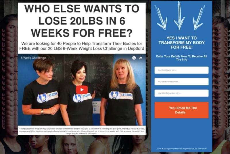
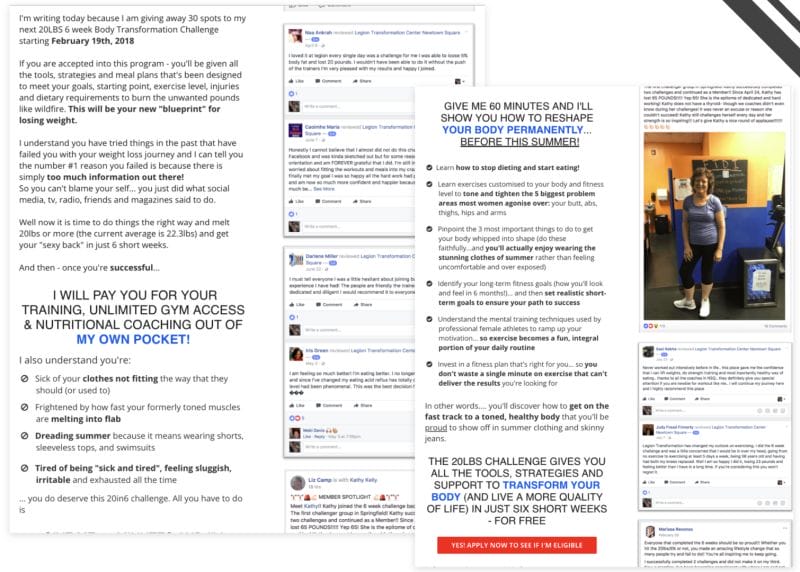
If Equinox’s landing page is a one-syllable grunt, Legion’s page is a full-on marketing monograph.
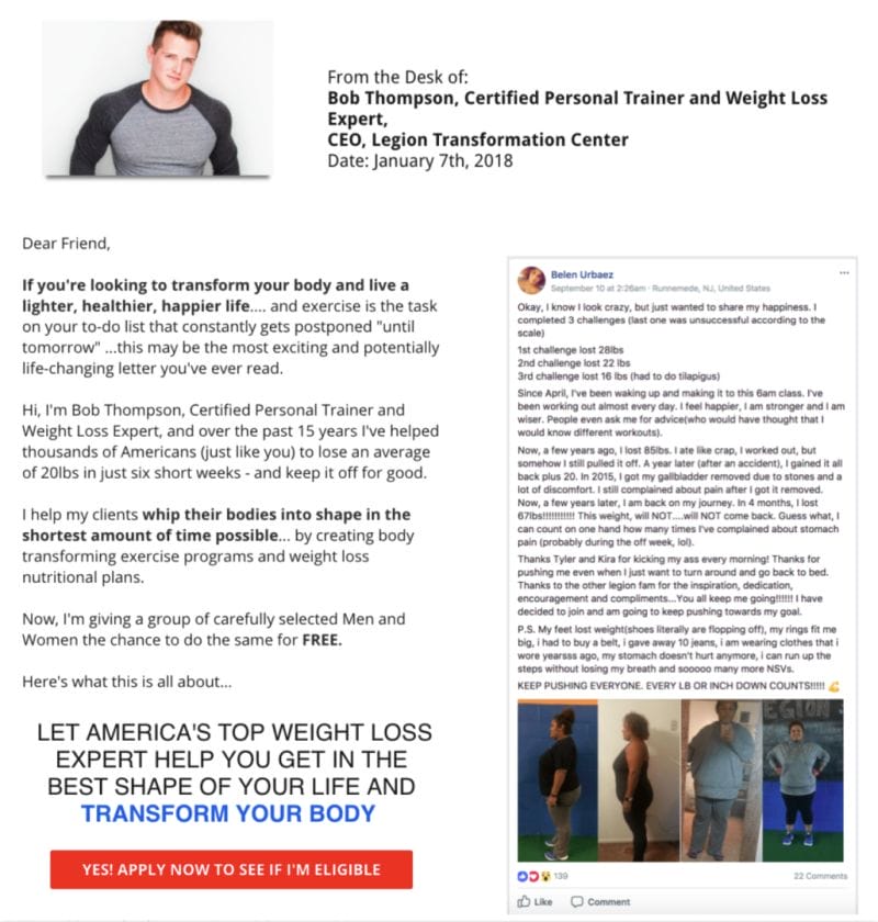
The page uses long-form copy to present (and repeatedly re-present) its offer while confronting any objections the reader might have. Objections will be brushed aside with social proof/testimonials, benefits, credentials, guarantees and promises. But it’s all going to push back to one offer.
In this case, that offer is very compelling and instantly obvious: Lose 20 lb. in six weeks for free. That’s like asking “who wants to be rich?” And all the reader has to do is enter contact info. That’s a great trade. Of course, Legion will use that contact info for remarketing and sales.
A general note unrelated to this particular ad: In some “free” challenges, prospective clients discover that the ads are a bait and switch, and the challenge isn’t free at all. This all-too-common technique usually results in significant backlash, and gym owners are advised to consider the risks of using it.
On Legion’s landing page, you’re going to scroll through a ton of social proof, with most of it hacked out of social media. Rather than laid out in beautiful font, it’s ripped from Facebook, and it feels authentic.
Also prominent on the page: a video sales letter or “value video,” which presents the offer in a slightly different way, explains what’s included and carpet-bombs the viewer with social proof that says, “This will work for you, too.”
Something else to note: The lead capture has only three fields. That’s low drag, and it can increase conversions.
Resource: 10 Form Conversion Best Practices (Backed by Research)
With the lead’s info captured, the funnel then pushes to Page 2, which asks the person to schedule an appointment. And some will. But if they don’t, that huge Page 1 already convinced them to provide contact info. That’s a win.
Key Features: Compelling, low-barrier offer. Long form copy. Video sales letter. Minimalist form.
5. 6-Week Challenge
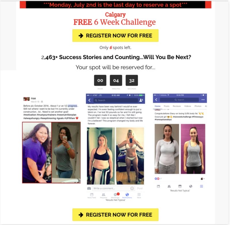
On this variation of a commonly used page, you’re going to hear a steady drum beat: free, Free, FREE, FREE! More copy isn’t really needed because one word does all the heavy lifting.
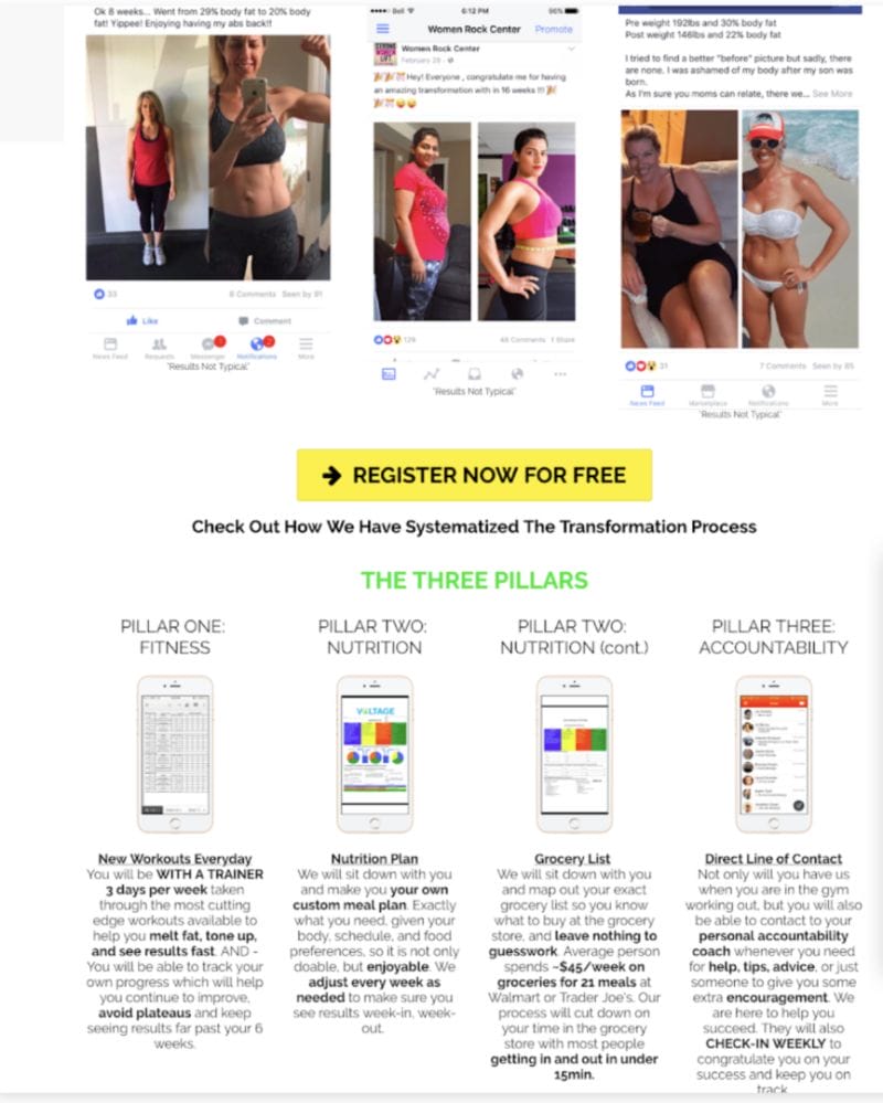
In between chants of “free” and clickable call-to-action buttons, you’ll find barrages of hack-and-slash social proof. In this case, it’s image heavy and shows before and after. Viewers don’t even have to read the text above the images to get the message. But if they do, they get the first-person voice in almost all cases, which creates a feeling of authenticity even if the names of the people in the pics have been cropped out.
The page kicks off with a dose of urgency: a timer that counts down. This can be effective—unless the timers are broken or reach zero. It’s almost certain that these advertisers will accept anyone at any time, and the urgency is just a marketing mechanism. But prospective clients don’t know that, and if they see a timer on zero, they’ll likely move on. This happens more often than you would think.
Toward the end, we see a section with benefits just in case people miss the fact that this thing is—wait for it—FREE!
After prospects opt in and supply contact info, they’re hit with another dose of urgency and pushed to book an appointment. Even if they don’t, the automation sequences have already been triggered.
Key Features: Low-barrier offer. Repetition. Compelling visuals. Urgency.
6. FitElite
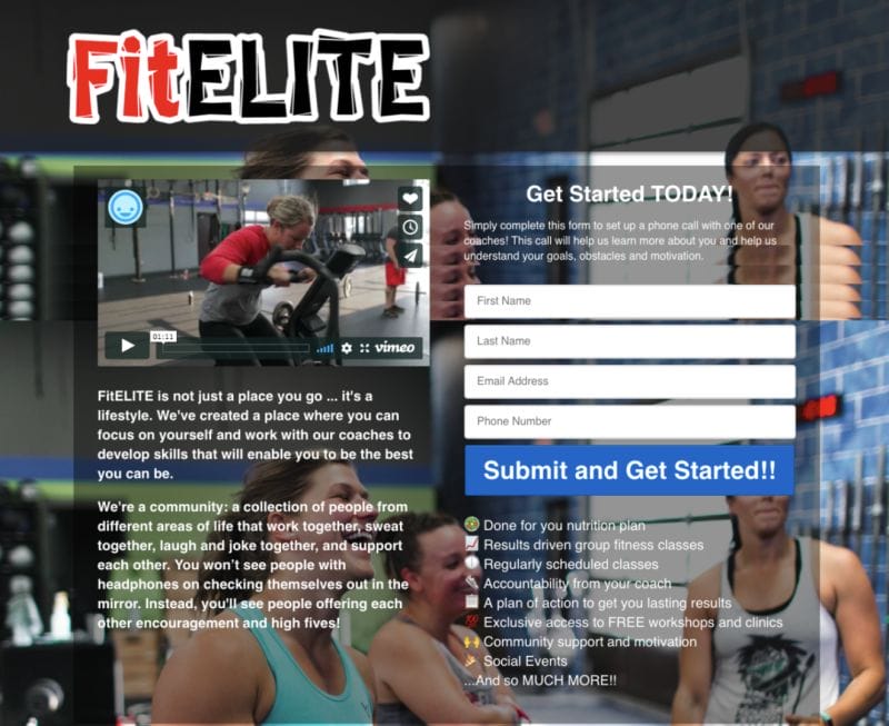
This very busy page is not viewer-friendly. And the logo at the top eats up a ton of real estate without offering much of a return.
The designers stitched together two identical images as a background for the text, and smiling people are a good thing. The problem is that the background images are busy and contain both light and dark spaces—so the white text is hard to read in some places even when placed in a box with a tinted background.
The font size changes throughout the page, and some of the most important info—the benefits—is very small. Bonus points are awarded for use of emojis, but the benefits here aren’t exactly home runs. They’re vague and full of jargon. Compare “results driven group fitness classes” to “lose 20 pounds in 6 months.”
Viewers just don’t immediately know what the offer is, and the longer they have to dig for it, the sooner they’ll bounce out without signing up. And the largest blocks of copy (on the left) don’t even present a compelling offer. Almost no one goes to the gym for the community. Sure, a few people do. But community and atmosphere are almost always secondary to things like losing weight, gaining muscle, looking good naked and so on.
Social proof is absent, and it’s worth mentioning that a last-name form field won’t do much here besides annoy mobile users. You’d likely get better results with three fields.
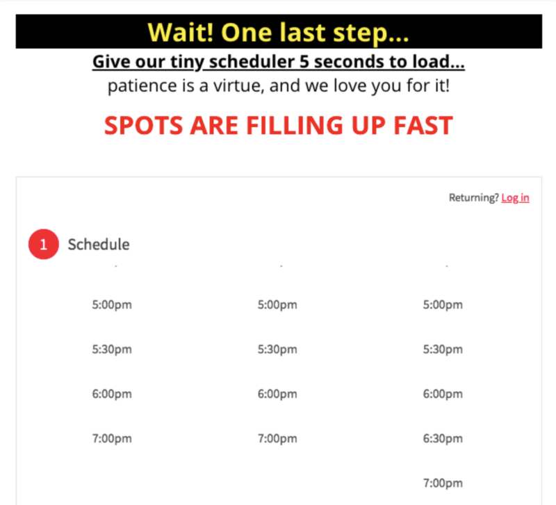
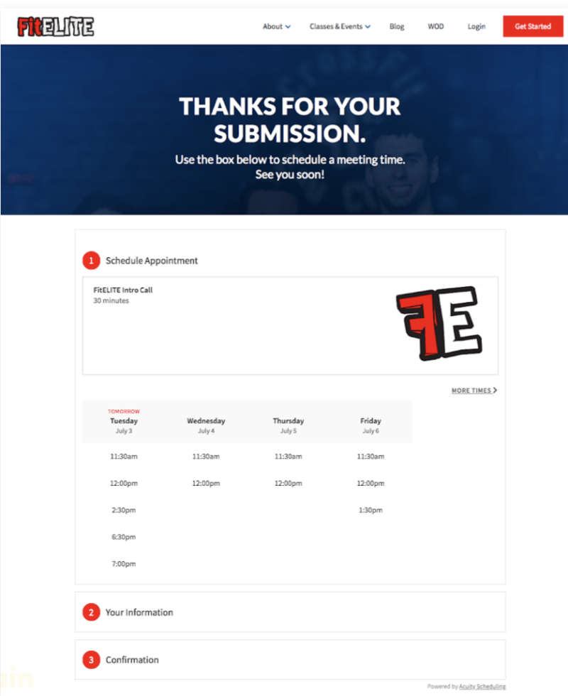
The second part is just a scheduler with no urgency, no sizzle reel, no social proof. If this funnel managed to get someone to Page 2, that person is offered little reason to take another step.
Key Features: Busy design. Vague offer.
7. Farmland Fitness
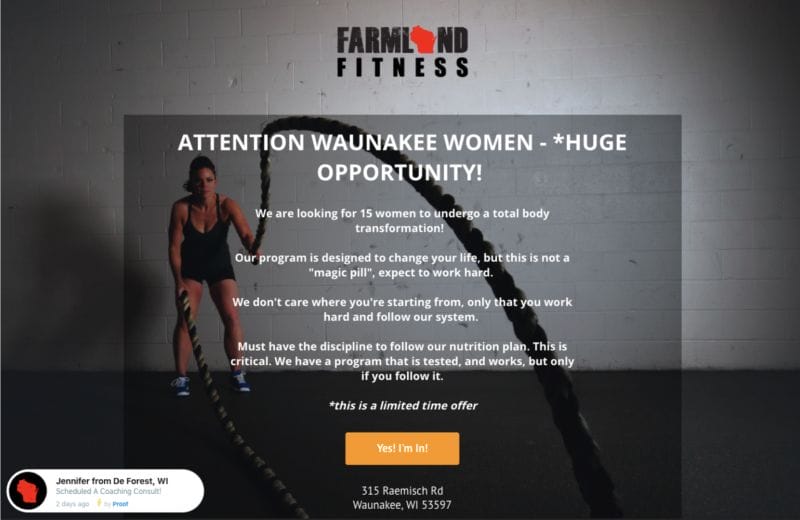
While this page makes better use of a background image—battle ropes look cool and are very common in marketing—the composition of the photo still makes the text hard to read. If you want to use a background image, make sure the photo has a large open space where you can put contrasting text that’s easily readable.
Think of a whiteboard or unadorned wall next to a person. That’s where you’d put your text. When building pages, find stock images that have the right composition, take a picture that will accommodate your desired text or have a good designer make sure your copy stands out. Squinting is always bad.
This page does get the headline right: It’s big and bold. And the offer is clearly stated with urgency: only 15 women will get to make a total physical transformation.
Most interesting is the bubble of proof on the bottom left. This is an automation that may or may not present actual info, and it’s designed to customize the landing page experience to the viewer. Its goal is to make the viewer think, “someone near me recently did this” or “everyone is doing this!” Proof and Nudgify are two software providers for this kind of thing.
Key Features: Suboptimal design. Clear offer. Software proof but no social proof.
8. CrossFit IceHouse
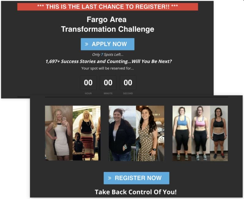
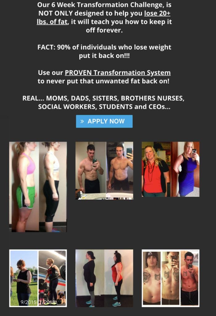
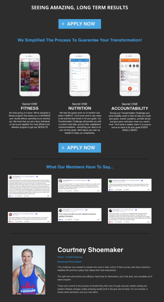
This page has a lot of good things going for it: The offer is clear and bold, social proof is everywhere, benefits are explained, and the copy is strong.
A few issues: The countdown timer says zero. As stated above, timers can create urgency, but viewers should never see zeroes. In many cases, people just don’t remember to update the timers and waste money sending traffic to offers that appear to have expired—even though they haven’t.
Similarly, before and after pictures are very effective, but presentation is important. You can certainly attempt to interrupt patterns by alternating which side of the image shows “before,” but if the images don’t show a dramatic change, you might confuse the viewer. Marketers want viewers to think “wow! What a change!” They don’t want people to wonder, “Which side is before and which is after?”
The page also uses a smiling coach and a bio to start forging a personal connection. That’s great.
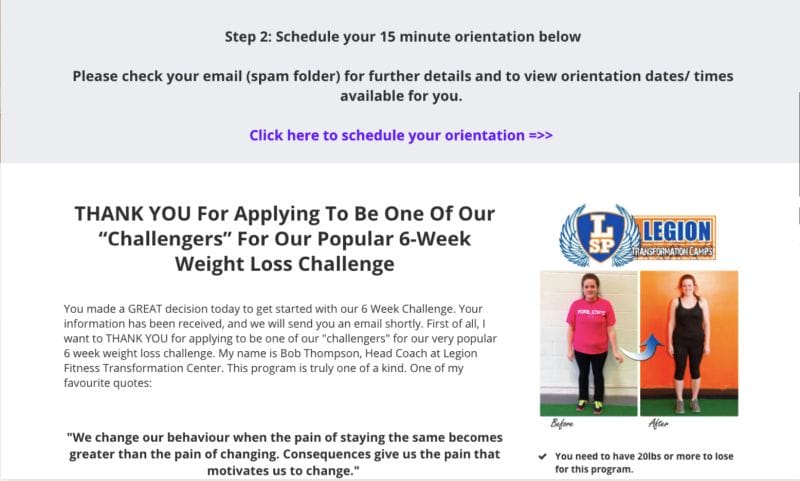
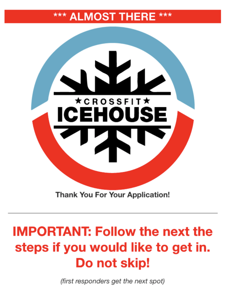
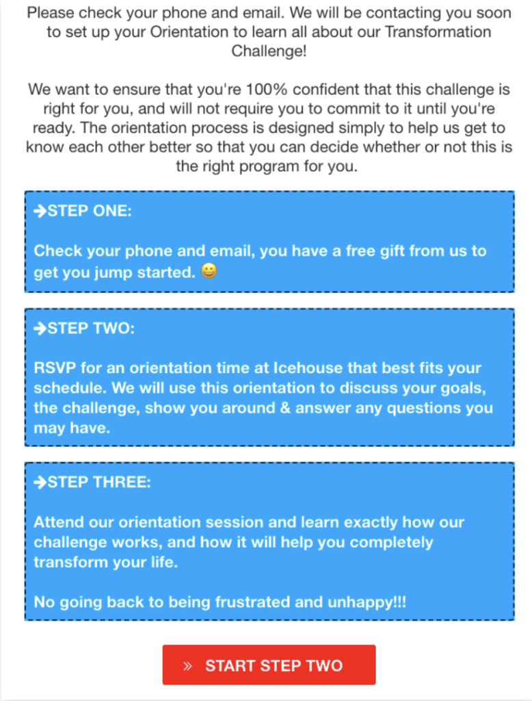
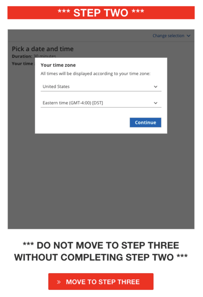
Perhaps most interesting aspect of this funnel is its screening process. Prospective clients opt in and are then directed to their email accounts for a gift. Then they’re asked to book an orientation in Step 2. The gym is calling its sales meeting an “orientation,” essentially assuming the prospect will buy. But the person is definitely coming in for a sales meeting.
While it might seem great to get as many leads as possible, no-shows are common and can put a strain on labor. In this system, the gym gets the lead’s info on opt-in for marketing purposes, then attempts to warm the lead and screen out bad fits before they book an orientation and block off a sales rep’s time.
Key Features: Clarity. Urgency. Social proof. Screening/warming process after lead capture. Uncommon language.
Tips for Building Gym Landing Pages: Industry Best Practices
Nothing says you can’t go your own way and experiment. You can. And many marketers do. But you might not want to if you aren’t prepared to track data relentlessly, invest time in page building and revision, and lose a little money before you find something that works.
With that in mind, here’s a quick list of best practices to keep in mind when you’re building a landing page for your fitness business.
Our Top 8 Tips for Creating Amazing Gym Landing Pages
1. Don’t clutter the space. Your page can be ugly as sin as long as it’s readable and clearly presents your offer. Choose the most garish colors you want. But people need to be able to tell what you’re offering and figure out why they should be interested in it.
2. Craft a compelling offer. Whatever you put on your page, people need to have a reason to opt in. That means you need to understand your target market and offer things they want. Do some research (or have a marketer do it for you).
3. Pepper the page with regular, prominent calls to action. People must be able to opt in easily at any time—especially “above the fold,” or as soon as they land on a page and before they have to scroll.
4. Research how form fields affect your demographic’s opt-in rates. It’s likely that fewer fields will generate more opt-ins.
5. Optimize your pages for mobile and desktop. Not one or the other. Both.
6. Use social proof. This is key. Use words, pictures, videos—anything that says, “People like us do things like this.” (Thanks to Seth Godin for that pearl of wisdom.)
7. Ensure you capture a lead’s info in some way even if they don’t sign up for your offer. A two-step page works very well. Leads have to enter contact info before they can sign up, which means you have their info even if they bolt from Part 2.
8. Get your leads into funnels with automations. Building these things takes time, but doing so will make you money. Let the robots warm your leads. Read our detailed guide to automation here: Marketing Automation 101.
How Do You Know if Your Fitness Landing Page Is Working?
Determining the quality of a landing page is simple:
If it converts, it’s good. If it doesn’t, it’s bad.
That’s it. It doesn’t matter if the page is hosted on your own site or built through Squarespace, ClickFunnels, Leadpages or any of the many other provides. Only conversions matter.
As we said above, you can paint by numbers and follow the best practices in the industry or you can try to stand out from the crowd with something completely different. In either case, you won’t be able to make sound decisions without data.
If you take nothing else from this article, take this: You must track your data and work to optimize your page.
If people are clicking your ads but don’t opt in, you have a problem somewhere. And you need to find it fast or you’re wasting money.
Your page is working if you see a steady stream of quality leads who become clients. If you hear crickets but keep receiving bills for advertising and landing page building software, you have work to do.
Use the analysis we presented above to figure out what’s right or wrong with your fitness business landing page. Then make adjustments. Repeat as necessary: Analyze and adjust.
Or, if you don’t want to spend all your time tweaking form fields and fonts, Gym Lead Machine tests and optimizes gym landing pages and can build sure-fire winners for you
